Artwork created for a light background does not always work on a dark one
The background participates in the image. Adapting artwork between light and dark shirts may require more than simply reversing colors.
It is quite common to receive artwork originally created on a white background and later hear a second request: “We also want to print this same artwork on a black shirt.”
When the image is only text or contains very simple elements, the adaptation can be easy. Black text on a white shirt can become white text on a black shirt. In that case, changing the color solves much of the problem.
But not every piece of artwork works that way.
In a more elaborate illustration, light and dark areas are not present only because certain inks were chosen. They are often part of the image’s construction.
A drawing made with black, red and blue on a white background may use the dark areas to define outlines, depth, shadows and small details. The white around those elements also shapes the way we see the whole.
When we move the same image to a black background, that relationship changes.
The background is also part of the image
This may be the most important point to understand.
Even when the background is not printed, it participates visually in the drawing.
On a white shirt, the fabric itself can serve as a large light area while we construct the image with darker colors.
On a black shirt, we can do the opposite: use the fabric as part of the dark areas and work with white and lighter colors to reveal shapes, outlines and details.
Artwork conceived from the beginning for a dark shirt can therefore be built differently from artwork intended for a light one.
That does not necessarily mean creating another drawing. It often means preparing a second version of the same artwork for a different relationship between the drawing and its background.
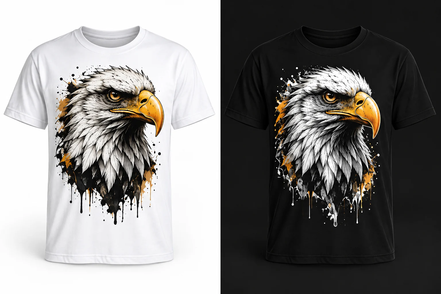
Changing black to white does not always solve it
For simple elements, that change can work perfectly. A word printed in black on a white shirt can be printed in white on a black shirt and keep almost the same reading.
Now imagine an illustration in which black represents deep shadows, outlines and details that define volume.
If we simply turn every black area white so it appears on the black shirt, we are not only changing the ink color. We are changing the visual role that color played inside the drawing.
An area that functioned as shadow may begin to act as light. A detail that receded may suddenly demand attention.
The result can look strange even if every part of the image is technically still present.
It is similar to looking at a photographic negative
Anyone familiar with film photography may remember negatives.
When we look directly at a negative, the light and dark relationships appear reversed. The photographic information is there, but we are not seeing the image as it should appear in the final result.
That comparison helps explain what may happen when we simply invert the light and dark areas of an illustration.
The image remains recognizable, but its visual logic may have been inverted.
Adapting artwork to a dark background therefore does not necessarily mean making a negative of the version used on a light background. The goal is to preserve the way the drawing should be perceived.
Sometimes the best approach is to prepare two versions
When a print will be used on both light and dark shirts, it is worth considering this during artwork preparation.
We can have one version for light backgrounds and another for dark backgrounds.
Some elements can remain exactly the same. Others may simply change color. Certain regions may need to be reinterpreted so that shadows, highlights, outlines and details continue to perform the same visual role.
The difference may be small in some artwork and substantial in other cases.
The important point is that the shirt color is not merely the place where the print will be applied. In many jobs, it becomes part of the composition itself.
Thinking about this from the beginning makes better use of both the inks and the fabric—and, above all, preserves the original intention when the image needs to work on very different backgrounds.