Simulated Process Color Separation
Professional Simulated Process color separation for screen printers and print shops, built around the artwork and real screen printing production.
Explore the service →A screen-printing color separation specialist with more than 20 years of experience in Spot Color, Simulated Process, and file preparation for clients in Brazil and worldwide.
Explore the services ↓ @photoshopsilkscreen ↗
Joel Mariano works with the image, channels, and real printing conditions to build separations that can be understood and carried out in screen-printing production.
My work does not begin with a technical category. It begins with the image and the result it needs to produce.
This space brings together the way I prepare images and color separations, the decisions that are part of each file, and the care required to preserve the result during screen-printing production.
The content is organized as a continuous reading experience, divided into chapters and accompanied by visual examples. A narrated version is also being prepared so that each section can be heard while viewing the images and following the explanations.
Every artwork is assessed individually. Explore the services currently available.
Professional Simulated Process color separation for screen printers and print shops, built around the artwork and real screen printing production.
Explore the service →Professional DTF artwork preparation with image cleanup, upscale, Spot White, halftones, special Spot channels and editable PSD files.
Explore the service →You send the artwork.
The image is assessed and prepared.
The color separation is built.
The final files are delivered through the Client Area.
Download demonstration artwork, examine the channels, follow the print sequence, and understand how the file was prepared before testing it in your own production.
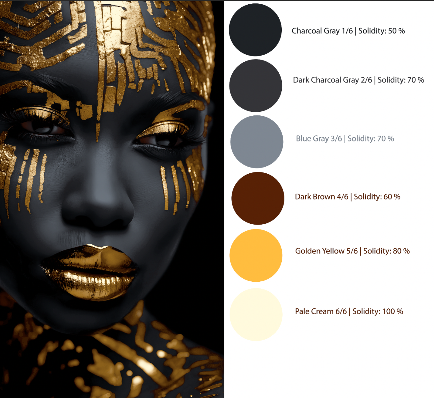
Six screens, no white underbase, exclusively for a black shirt: a construction from dark to light.
The editorial area brings together articles based on real color-separation and artwork-preparation situations.
Starting with light or shadow changes what each ink needs to do. Butterfly and Golden Empress show two ways to plan how an image is built in print.
Explore Knowledge & Resources →The Guide brings together six chapters about interpreting and printing the files, plus nine sections dedicated to image preparation.
A guide to understanding the decisions made during color separation and preserving those decisions in screen-printing production.
Each job is delivered with an image showing the expected result, the colors used, and the print sequence.
The colors appear in the order in which they should be printed, beginning with the first ink applied to the garment and continuing through the last. This order is important because it is part of how the image is constructed.
Next to each color, the Opacity value used in the Photoshop simulation will also be shown. This value is not a formula for mixing the ink and does not represent its actual coverage. It serves only as a visual reference.
For example:
White: Opacity 75%
Light blue: Opacity 80%
Yellow: Opacity 5%
Black: Opacity 100%
A lower Opacity indicates that, in the simulation, that ink allows more of the colors underneath to participate. A higher Opacity presents a visually more solid color in the simulation.
The printer does not need to reproduce this percentage mathematically. It should be used only to understand the expected behavior of the ink within the artwork.
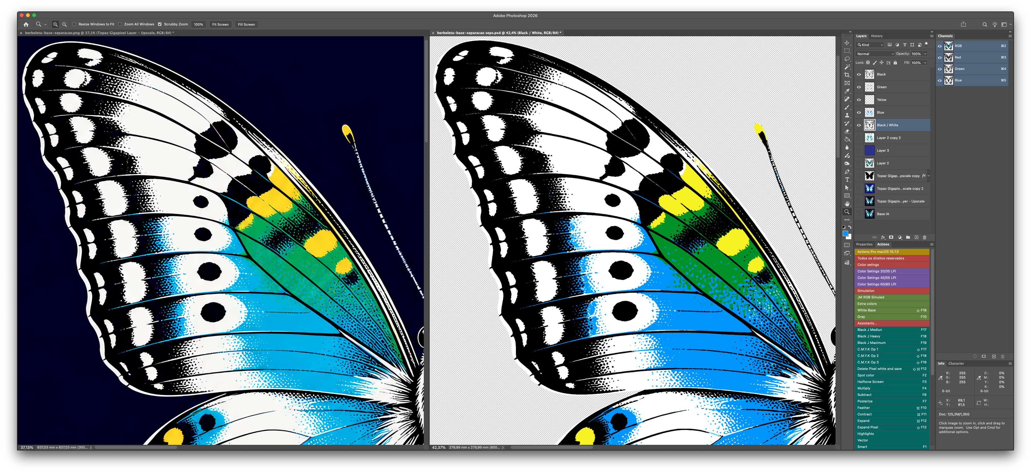
In the visual example, white represents the underbase applied to a dark garment. Blue is printed over that underbase, while the low-Opacity yellow appears by itself in some areas and interacts with the blue in others, visually creating green.
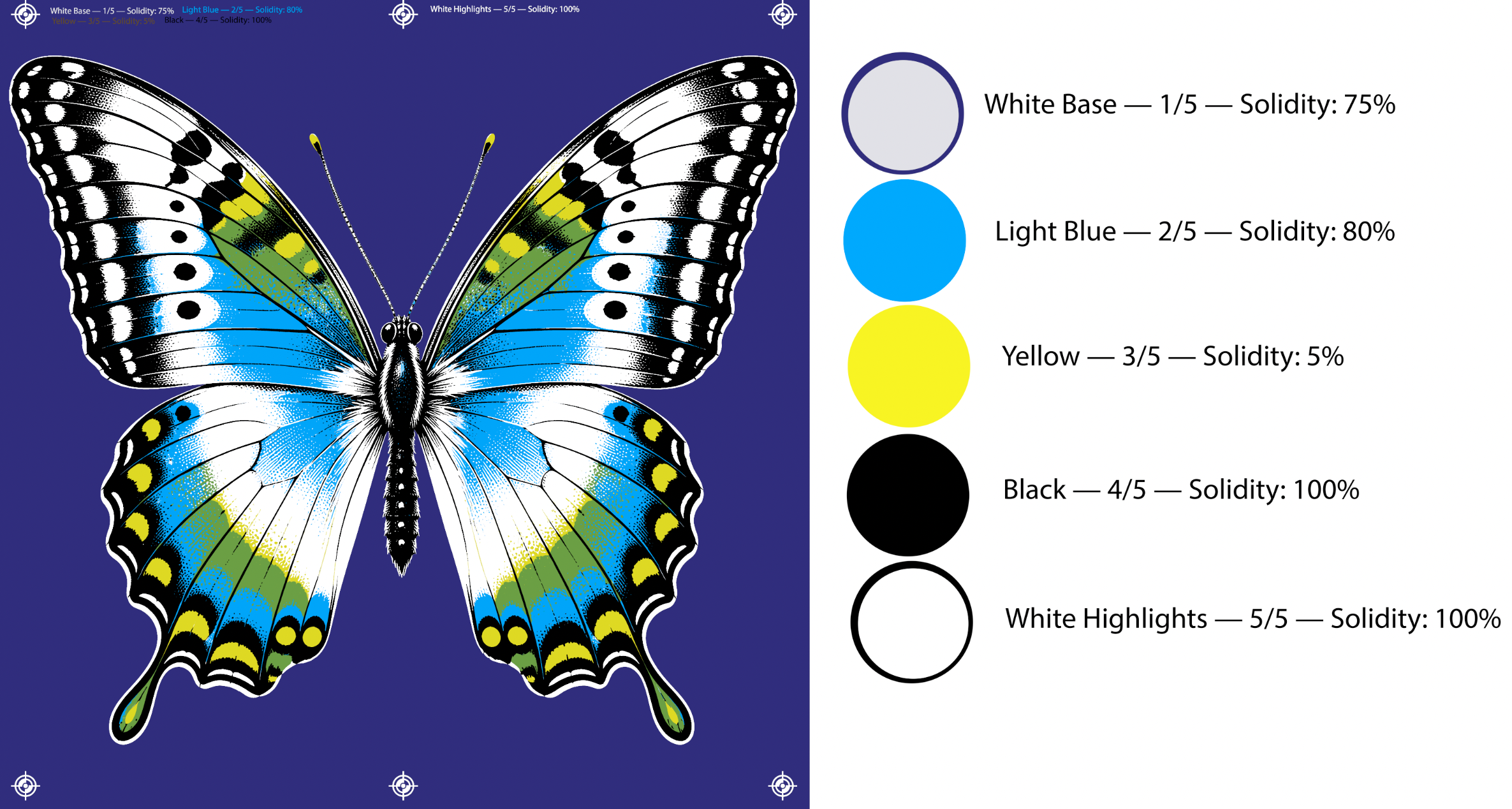
Not every color visible in the print needs its own screen. Some colors can be created by overlapping inks.
Imagine artwork with a white underbase, an opaque light blue, and a more translucent yellow. When the yellow is applied over selected areas of the blue, the two visually create green.
This means that one blue screen and one yellow screen can produce blue, yellow, and green in the same image.
This principle can be applied to many other combinations. Some inks are used to cover and create a solid color. Others are used to interact with colors that have already been printed.
This is why my files do not always follow a single technique. The same artwork may combine process colors, opaque colors, halftones, solid color areas, fine lines, and traps. Each part of the image receives the treatment best suited to the result it needs to produce.
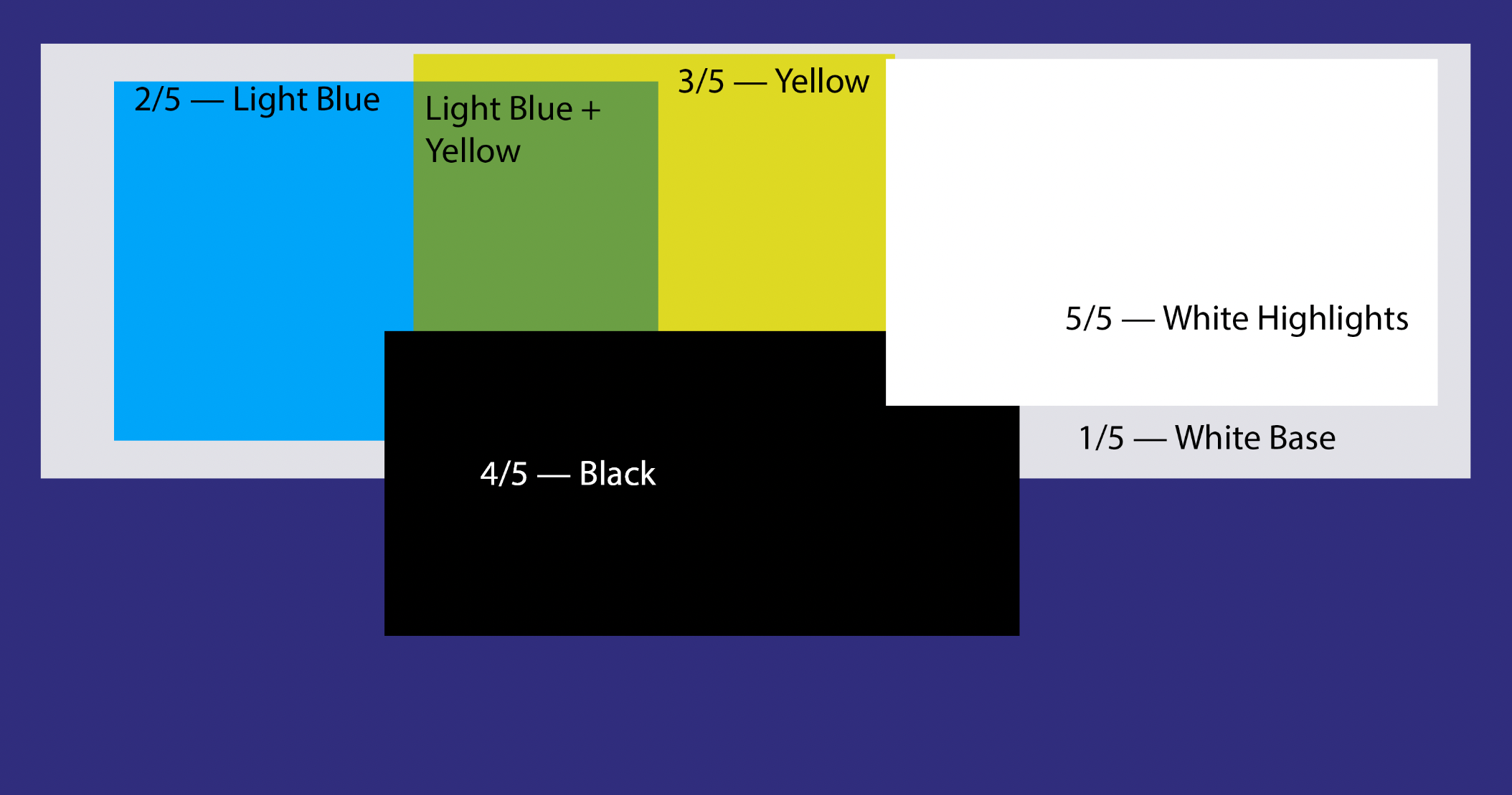
The color order is established during color separation.
If a translucent yellow was prepared to print over a blue, reversing that order may produce a different result. The more opaque blue may hide the yellow and prevent the intended green from forming.
The sequence also accounts for wet-on-wet printing. When two inks that need to interact are printed immediately one after the other, ink may transfer between the garment and the screen, causing contamination or changing the mixture.
To avoid this, I may place one or two colors between them. This interval helps the previous ink stabilize before it receives the next layer.
When necessary, a flash may also be specified. All of this planning is already considered during color separation. The operator only needs to follow the sequence shown in the file.
Whenever possible, colors may receive a name and an approximate Pantone reference.
Some colors, however, do not have an exact match in the Pantone system. In those cases, the printer should use the supplied image as a reference and mix an ink that is visually close to the result shown.
The final appearance also depends on the garment, the white underbase, the amount of ink deposited, the mesh used, and the colors printed previously. For this reason, a Pantone reference alone does not always represent the final color that will appear in the print.
Jobs may be delivered as PSD, EPS, and PNG files.
When the client has an output RIP, the channels may be delivered so the halftones can be generated within their own system.
When the client does not have a RIP, I can deliver PNG files with halftones already generated in Photoshop. In that case, the client must specify the desired line count in advance.
If the client is unsure which line count to choose, I can recommend an option based on the screens and exposure conditions available in their print shop.
A very fine halftone can reproduce more detail, but it requires greater precision in film output, exposure, and washout. Larger dots are easier to wash out, but they may reduce definition.
The best choice is not simply the finest dot. It is the dot that the print shop can reliably expose and print throughout the entire production run.
The line count also depends on the screen being used. Mesh count alone does not determine ink flow: thread diameter, mesh opening, and mesh stability also affect the result.
Even with a well-prepared separation, an unsuitable screen can cause loss of detail, difficulty registering the colors, and uneven ink flow.
The mesh should be high quality, properly tensioned, and maintain uniform tension. This stability helps preserve registration during production and allows the screen to release correctly after the squeegee stroke.
For images with fine detail and halftones, we recommend monofilament polyester mesh selected according to the requirements of the artwork and the ink being used.
Mesh count is important, but it does not determine screen behavior by itself. Thread diameter also affects mesh opening and ink flow.
Two meshes with the same mesh count can have different openings. A thinner thread generally provides more open area and less interference with image detail. However, it also requires proper tensioning and greater care during preparation and use.
For this reason, there is no single ideal mesh for every job.
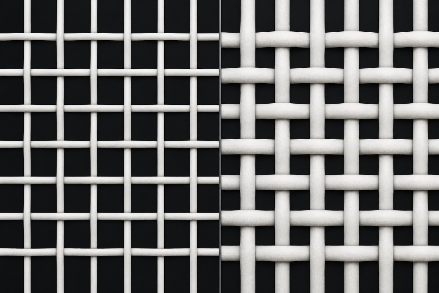
White and yellow meshes can behave differently during exposure.
White mesh is widely used for general work. For images with halftones and fine detail, yellow mesh can help reduce light scattering during exposure, better preserving the smallest dots and image edges.
Mesh color may also change the required exposure time. Therefore, whenever the mesh, emulsion, coating, or light source changes, run a new exposure test.
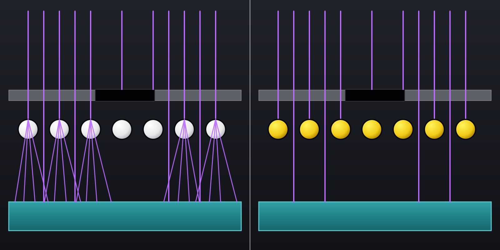
Screen selection should balance:
image definition;
ink flow;
amount of ink deposited;
mesh strength and stability.
The best screen is not necessarily the highest mesh count or the one with the thinnest thread. It is the screen that can reproduce the artwork’s details while allowing safe, consistent ink flow throughout production.
In addition to mesh count, consult the thread diameter, mesh opening, open area, and tension recommended by the manufacturer.
For more detailed information, consult documentation from specialized manufacturers:
These references are provided for technical consultation and do not require the use of any specific brand.
The stencil’s function is to allow ink to pass only through the correct areas while preserving the dots, edges, and details prepared during color separation.
A quality emulsion helps, but the most expensive product is not necessarily the most appropriate. Some emulsions are designed for halftones and high definition, while others prioritize durability, thick coatings, or specific applications.
The important point is to choose an emulsion capable of reproducing the image details and resisting the type of ink and production conditions involved.
Before preparing the stencil, verify that the emulsion is suitable for:
fine detail and halftones;
the type of ink being used;
the available exposure system;
the desired coating thickness;
the durability required during production.
Using an unsuitable emulsion can make it difficult to open the smallest dots or reduce stencil durability during printing.
Always follow the manufacturer’s instructions for preparation, coating, exposure, drying, and storage.
Before coating, the mesh must be clean, properly prepared, and completely dry.
The emulsion coating must be uniform. Differences in thickness can affect exposure and cause areas of the same stencil to behave differently during washout.
After coating, the screen should dry in a clean environment protected from dust, moisture, and inappropriate light. The emulsion must be completely dry before exposure.
When the image is transferred using film, contact between the film and the emulsion must be firm. Any gap between them may increase light scattering and compromise small dots and fine edges.
The result can also be influenced by the light source, distance, exposure time, emulsion thickness, and mesh color. Whenever any of these conditions changes, exposure time should be checked again.
The safest way to determine this time is to run tests with an exposure scale or exposure calculator instead of relying only on a fixed value.
Some print shops use digital systems that create or expose the image directly on the screen, eliminating the need for film. Regardless of the system, the goal remains the same: reproduce the image with definition and produce a sufficiently durable stencil.
During washout, every area intended to pass ink must open completely.
Underexposure can leave the stencil weak or cause residue. Overexposure can make the smallest details difficult to open. Washing should remove emulsion from the image areas without damaging the dots that need to remain.
After washout, inspect the stencil against the light. Open areas should be clean, without haze or residue that could block ink flow.
The stencil must dry completely before printing.
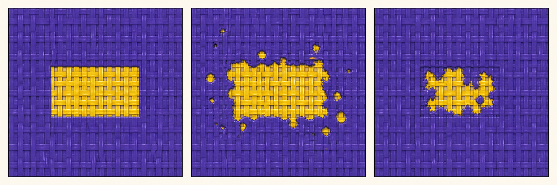
Before production, confirm that:
the smallest intended dots are open;
there is no residue in the ink-flow areas;
the emulsion is completely dry;
the stencil has adequate durability;
there are no defects or pinholes outside the image.
A poorly washed-out stencil can cause insufficient ink, color loss, and disappearing details. No adjustment to pressure, squeegee, or viscosity can replace an area that should be open but remains partially blocked.
A good washout does not create information that is absent from the file. It ensures that the details prepared during color separation can reach the print correctly.
For more detailed information, consult:
Agabê ↗ — Screen preparation manual
Agabê ↗ — Photographic emulsions
SAATI ↗ — Screen-printing emulsions
SAATI ↗ — Exposure control
These references are provided for technical consultation and do not require the use of any specific brand. Always follow the instructions for the emulsion and exposure system being used.
In my separations, each ink has a function. Some colors need to cover what lies beneath and create solid areas. Others need to be more translucent so they can interact with previous layers and create new tones.
For this reason, using an ink that merely looks similar is not enough. It is necessary to understand how that ink is expected to behave within the artwork.
The Opacity shown in the file serves as a visual reference. It helps indicate whether the color should behave more solidly or allow the underlying colors to participate more. This percentage is not a formula for mixing the ink and does not mathematically represent its actual coverage.
Two inks may have similar hues and different covering power.
One ink may be mixed with a more transparent base, allowing underlying colors to contribute to the result. Another may use an opaque base and a higher-coverage formulation to create a more solid area.
Titanium dioxide is one of the components responsible for the whiteness and opacity of white inks and many opaque bases. Final coverage, however, also depends on the pigments, formulation, mesh, printed underbase, and amount of ink deposited.
Use an ink capable of reproducing the behavior indicated in the separation: coverage when the color needs to remain solid and transparency when it needs to interact with other layers.
When an ink helps form other colors, a small difference in hue can alter several areas of the image.
Yellow printed over blue, for example, does not always create the same green. The result depends on the hue of both inks, their transparency, and the amount deposited.
When a Pantone reference is provided, use it as a starting point. When there is no exact match, compare the ink with the supplied image and produce a sample under the same conditions planned for production.
Color should be evaluated after printing. The garment, underbase, mesh, sequence, and ink deposit all affect its final appearance.
The ink should pass through the stencil easily enough to reproduce details without spreading beyond the intended areas.
Ink that is too viscous may flow poorly, require greater pressure, and fail in the smallest dots. Ink that is too fluid may spread more, cause dot gain, and reduce definition.
With water-based inks, evaporation during production can gradually increase viscosity and promote drying in the screen. Temperature, air circulation, idle time, and the amount of ink on the screen also affect this behavior.
Plastisol does not dry in the screen in the same way, but it must be thoroughly mixed. Mixing, temperature, and the movement of printing itself can change its flow.
Each system has its own characteristics. The operator needs to understand the ink being used and keep its behavior stable throughout production.
These products do not serve the same function.
A reducer changes viscosity. A retarder slows drying. A flow additive improves how the ink behaves during printing.
Use only compatible additives and only in the amounts specified by the manufacturer. Excess may alter coverage, hue, cure, and ink durability.
Before placing ink on the screen, I usually lightly moisten the open image area with the same compatible viscosity reducer that will be used with the ink.
I apply a small amount of the product to a clean, lint-free cloth. I gently wipe the open stencil area as if lubricating the mesh threads, then remove all visible excess.
The stencil should not remain wet or have any product pooled on it. The goal is only to lightly condition the thread surfaces so the first contact with water-based ink is smoother.
This preparation makes the first ink pass through the dots easier and helps reduce the risk of blockage at the start of printing.
Use only the reducer specified for the ink system being used. This tip does not replace viscosity control or correct a poorly washed-out stencil.
Before beginning, prepare enough ink for the job, record the formula used, and print a sample on the actual garment.
During production, monitor hue, coverage or transparency, viscosity, and ink flow through the stencil. These factors must remain stable to preserve the dots, edges, and planned appearance.
A good ink is not simply one with an attractive color. It is one that maintains predictable behavior throughout production.
For information about inks and additives, consult:
Agabê/Virus ↗ — Water-based inks and additives
Gênesis ↗ — Water-based inks and related products
Avient ↗ — Plastisol inks and additives
Marabu ↗ — Screen-printing inks and additives
These references are provided for technical consultation and do not require the use of any specific brand. Always follow the instructions from the manufacturers of the ink and additives being used.
The squeegee controls ink flow through the stencil and directly affects coverage, definition, and dot gain. Even with a good separation, a properly washed-out screen, and the correct ink, uncontrolled transfer can change the result.
The goal is not simply to deposit as much ink as possible, but to transfer the necessary amount uniformly while preserving image detail.
For jobs with halftones and fine detail, use a squeegee with a straight profile and a clean, sharply defined square edge.
A worn blade or rounded edge loses precision. It tends to deposit too much ink, increase dot gain, and reduce print sharpness.
The squeegee should be inspected during production and replaced or sharpened when its edge no longer provides uniform transfer.
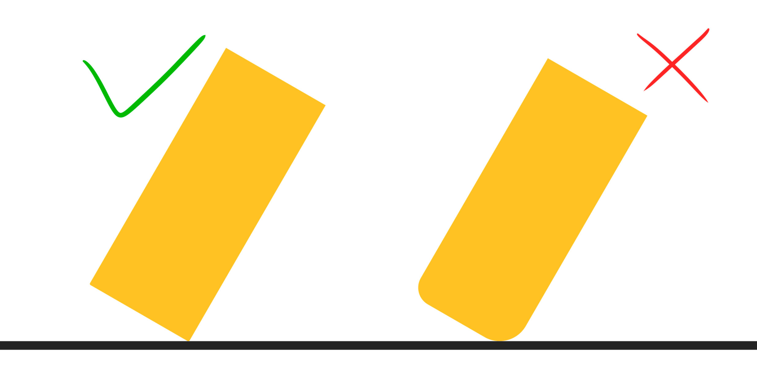
Squeegee hardness affects the amount of ink deposited and print definition.
A blade that is too soft deforms easily and may deposit too much ink. An excessively hard blade offers greater edge control but may not conform well to certain surfaces or printing conditions.
For halftone work, a medium-to-high durometer is usually a good starting point. However, there is no universal durometer. Selection should consider the ink, mesh, garment, equipment, and required coverage.
The squeegee angle changes how the blade contacts the screen.
A squeegee used at a lower angle, lying flatter relative to the screen, tends to flex more and may increase ink deposit. This can be useful in some situations, but it also increases the risk of dot gain. A more upright position provides greater edge control and can help preserve detail.
Pressure should be only what is necessary to move the ink through the stencil and onto the garment. Excessive pressure can distort the mesh, spread the ink, and compromise registration and definition.
Speed must also be balanced. A stroke that is too fast may not transfer all the necessary ink. An excessively slow stroke may increase the deposit and change dot behavior.
The most important goal is to find a stable combination of angle, pressure, and speed.
Whenever possible, achieve the necessary transfer with a single stroke.
In some situations, especially when ink is printed directly on the garment and needs greater coverage, a second stroke may be necessary. This should be established during testing.
For detail colors applied over already printed layers, one well-controlled stroke generally helps preserve halftones better. Repeated strokes can increase ink deposit, fill in details, and cause dot gain.
If many strokes are required to achieve the result, check ink viscosity, mesh, stencil, pressure, and blade condition. Increasing the number of strokes does not always correct the actual cause of the problem.
When the equipment allows off-contact adjustment, the distance should be only enough for the screen to touch the garment during the squeegee stroke and release immediately afterward.
Too much distance requires more pressure, strains the mesh, and may compromise registration. Too little distance may cause the screen to remain in contact with the ink after the stroke, reducing definition.
Correct screen tension is also important for this release to occur quickly and evenly.
Before printing, ink should properly fill the stencil’s open areas. This preparation helps the next stroke transfer ink uniformly.
The flood stroke should not force an excessive deposit. Its purpose is to keep the image supplied with ink and ready for the next print. With water-based inks, this also helps prevent ink from beginning to dry in the stencil’s open areas.
In automatic printing, pressure, angle, speed, and number of strokes are established during setup. Once the result is approved, these parameters should be maintained.
In manual printing, consistency depends mainly on the operator. It is important to repeat the angle, pressure, speed, and number of strokes on every garment.
In both processes, monitor the condition of the squeegee edge and the behavior of the ink. Use the lowest pressure and fewest strokes capable of producing the necessary transfer while preserving coverage and definition.
A good print depends on the way all colors work together. Registration, print order, and intermediate drying are therefore fundamental parts of constructing the image.
Even if the screens, inks, and other materials are correct, failures in these stages can compromise the final result.
In work with halftones and overlaps, registration needs to be precise. Small shifts can create unwanted outlines, alter details, and change the colors formed by combining inks.
Some artwork includes small compensations to account for the natural variations in the process. These margins help prevent gaps between colors, but they do not correct inaccurate registration.
Before production begins, check the position of every screen and pay particular attention to areas with fine details, edges, and overlaps.
The sequence specified in the file is part of how the artwork is constructed. Each color was prepared with consideration for the inks applied before it and those that will be printed afterward.
Changing this order can alter coverage, hue, overlaps, and the formation of new colors.
It is also important to respect the specified behavior of each ink. A color prepared to behave translucently will perform differently if replaced by a high-coverage ink.
Ink order and ink behavior must be considered together.
In some overlaps, the previously applied ink needs to be sufficiently stable before receiving the next color.
If a new ink is applied immediately over a layer that is still too wet, unwanted mixing, ink pickup on the underside of the screen, or changes to the planned color may occur.
This stabilization can happen in different ways depending on the production system. It can be achieved with flash equipment, a heated platen, or the interval created by printing other colors.
The important point is not to use a specific piece of equipment, but to ensure that the layer is in the proper condition to receive the next application.
Intermediate drying serves only to stabilize a layer while the image is being constructed. It is not necessary to fully cure the ink between every color.
Excessive heat can also harm the job by changing the ink surface, the behavior of subsequent layers, or the stability of the garment.
At the end of printing, the complete cure must follow the ink manufacturer’s recommendations and the conditions appropriate for the material being used.
Before production begins, print a complete sample using every color in the specified order.
Check registration, hues, overlaps, ink deposit, and layer behavior on the garment under actual production conditions.
After approval, this sample becomes the reference that should be maintained throughout the entire run.
A good print does not depend on a single technique or material. It is the result of balance among the file, screen, washout, ink, squeegee, registration, sequence, and drying.
When each stage respects the function for which the artwork was prepared, the colors work together, details are preserved, and the result approaches the simulation shown in the file.
How I evaluate, size, enlarge, cut out, and correct an image before beginning color construction.
The quality of the file received directly affects the work required to prepare artwork for screen printing.
When the image arrives at an appropriate size, with defined edges, clean colors, and preserved details, I can move directly into building the separation. When it has low resolution, inaccurate cutouts, softened edges, or poorly defined elements, it needs to be corrected first.
The final print size must also be considered. An image may look good on screen and still lack enough detail to be enlarged and printed at the desired size.
Before I begin treating the image, I need to know the final size at which the artwork will be printed. This measurement may be provided in centimeters or inches, according to the client’s standard.
Once the size is defined, I prepare the document at the working resolution and only then begin enlarging, cutting out, cleaning, correcting, and rebuilding details. This way, all preparation is performed with the actual print dimensions in mind.
Although the file can be resized later, that change may require Photoshop to recalculate the image pixels. With edges, fine lines, and small details, this process may create slight softening or changes. Whenever possible, I therefore prefer to work at final size from the beginning.
A resolution of 300 PPI is sufficient for many printing applications. For my screen-printing files, however, I normally work at 600 PPI at the final print size.
This standard provides a denser pixel grid for constructing fine lines, edges, and other delicate elements. It is especially useful when the file’s own pixels are used to form halftone dots in Photoshop.
The more pixels available at the same physical size, the more precisely these dots and details can be represented. This contributes to sharper film output and more reliable reproduction during stencil washout.
Simply changing the resolution number from 300 to 600 PPI, however, does not recover missing detail. The original image must contain enough information. When it does not, it must first be enlarged, corrected, or reconstructed.
Artwork created in vector programs such as Illustrator or CorelDRAW needs to be exported correctly when it will be handled as pixels in Photoshop.
For lettering, outlines, and solid color areas, I prefer files with sharply defined edges and no anti-aliasing. Anti-aliasing creates partially transparent pixels or intermediate colors along edges.
On screen, this can make an edge appear smoother. During separation, however, these pixels may create halos and transitions that are not part of the artwork’s original construction and need to be corrected.
This does not mean removing genuine gradients. A tonal transition that belongs to the image must be preserved and prepared for printing. The important point is to distinguish an intentional gradient from a softened edge created during export.
Images generated by artificial intelligence also need to be evaluated before separation. Even when they look detailed on screen, they may have insufficient dimensions, irregular edges, artificial textures, and small elements without definition.
When necessary, the first treatment is AI upscaling. This process increases image dimensions and may recover or reinterpret some details, but it does not automatically create artwork ready for screen printing.
After enlargement, I inspect the file in Photoshop, evaluate the edges, review the cutout, and correct areas that still lack sufficient quality.
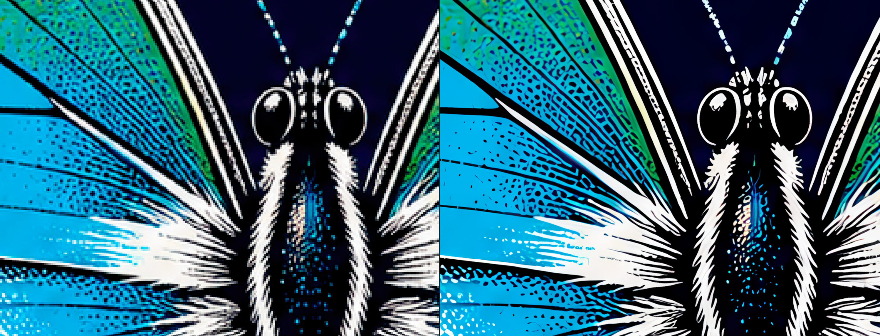
Background removal also needs to be checked. Even when the client supplies an image that appears to be cut out, residue, halos, partially transparent areas, or important parts removed by mistake may remain.
The cutout is reviewed together with the image’s small elements. The goal is to preserve what truly belongs to the artwork and remove information that could interfere with color separation.
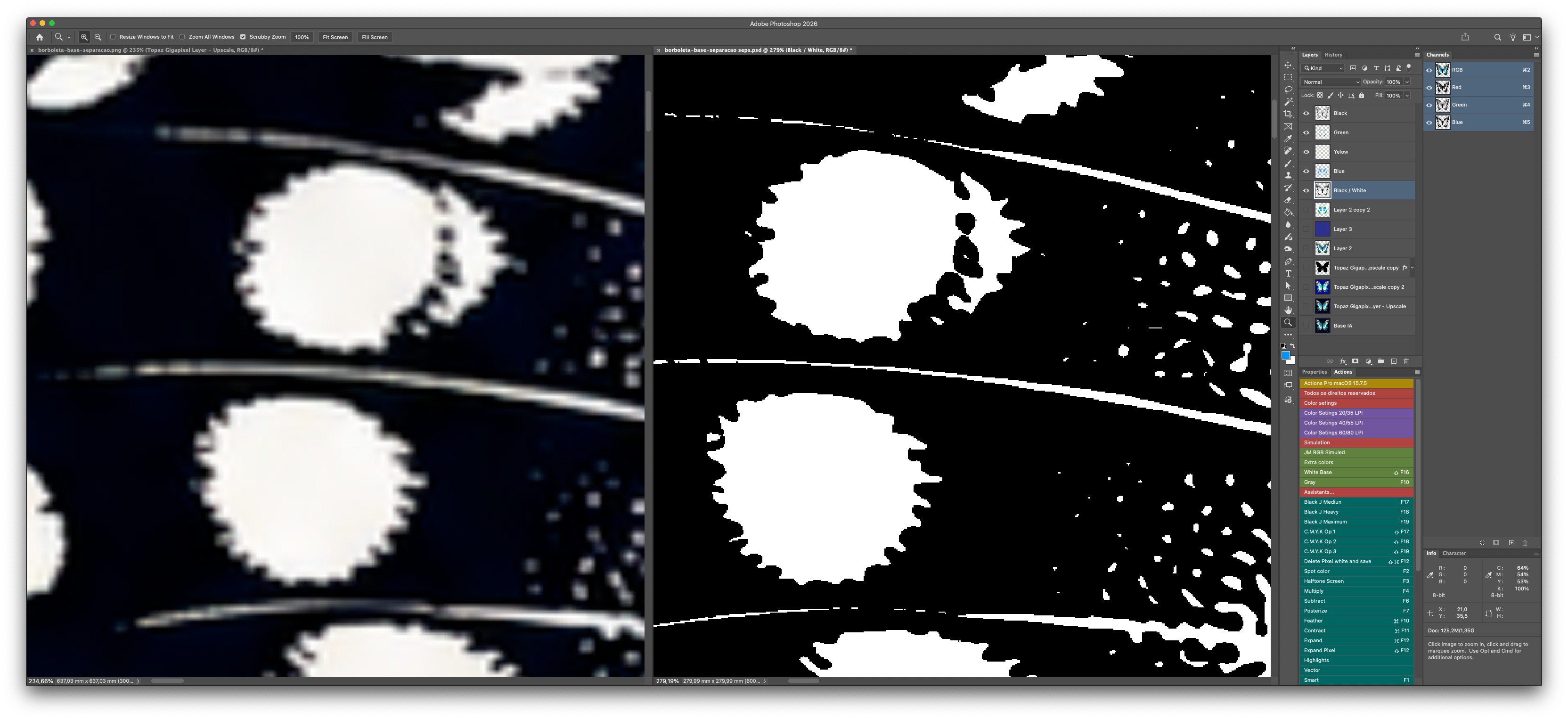
Some problems become visible only when the image is viewed at high magnification. Irregular edges, isolated pixels, small gaps, and inaccurate transitions may go unnoticed in the full-image view.
This inspection makes it possible to decide what should be preserved, cleaned, or reconstructed. Correction is not automatic: each area is evaluated according to its role in the image and the expected print result.
Files can follow two different paths.
When the client does not have a RIP for generating halftones, I can supply channels with the halftones already prepared in Photoshop. In this process, the 600 PPI resolution helps form the dots more precisely within the file itself.
When production uses a RIP, channels can be delivered without finished halftones. In that case, dot formation and output parameters are defined in the client’s system.
Both paths are valid. The choice should be made before final file preparation, considering the equipment, workflow, and production conditions of each print shop.
Enlarging, cutting out, cleaning, or reconstructing an image is not the same as separating its colors.
Preparation corrects and organizes the source material so it can be used reliably. Separation begins afterward, when colors, underbases, overlaps, and details are constructed according to the printing process.
The better the received file, the more directly the work can advance to separation. When the image requires corrections or reconstruction, there is an additional preparation stage before color separation can begin.
Color separation, preparation, and image treatment for print shops, brands, and artists. Service available nationally and internationally.