The artwork defines the separation
I work mainly with Spot Color and Simulated Process, combining different resources whenever the image requires it.
One design may contain solid areas, logos, typography, complex details, shadows, highlights, and color transitions. Those parts do not need to be treated in the same way. A solid area can be built as traditional Spot Color, while a complex illustration may require Simulated Process and interaction between different inks.
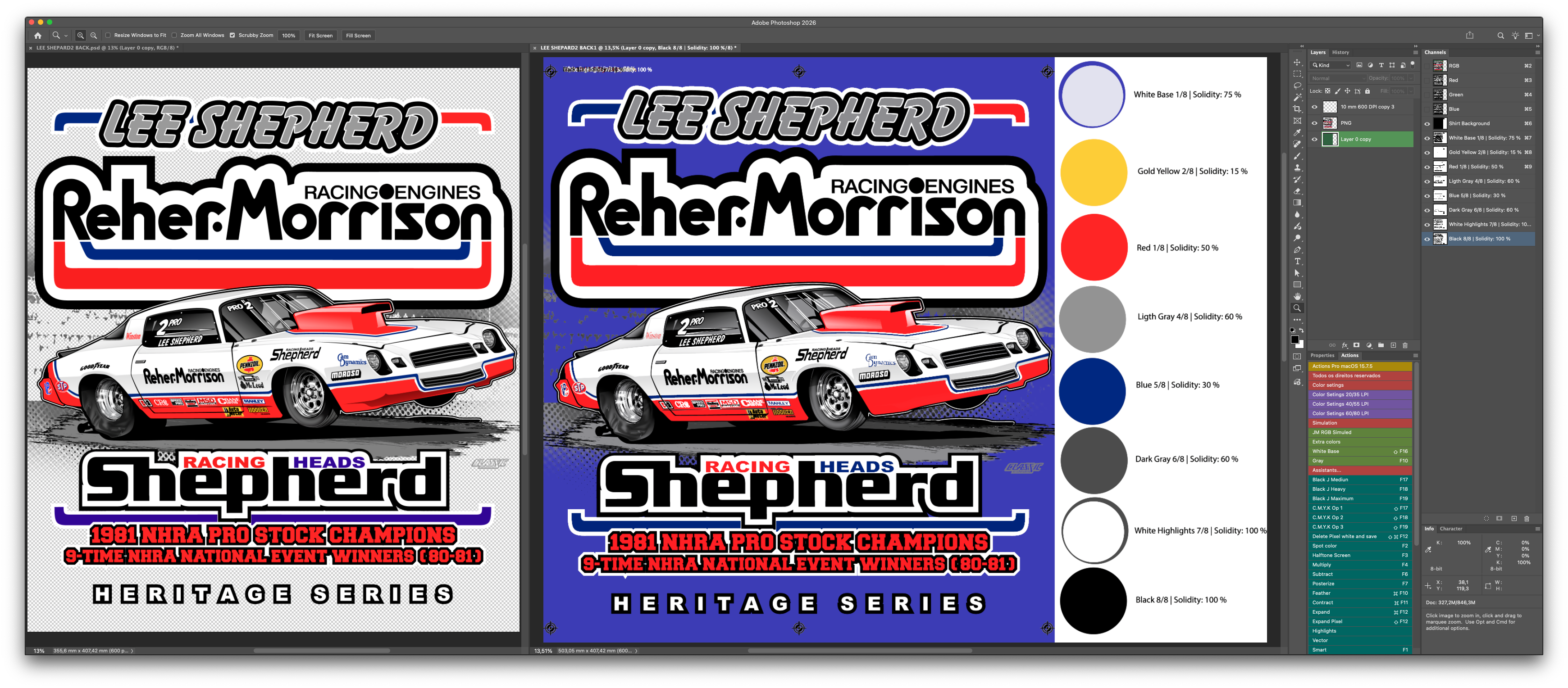
I work on every channel manually, with specific adjustments in each area. The goal is not simply to isolate a color and apply general corrections. It is to build every part of the separation around what that image actually needs.
Manual work, channel by channel
Each color channel is worked on individually, with specific adjustments according to what the artwork requires.
This approach lets me balance solid areas, halftones, overprints, and details without forcing the entire artwork through a single automated recipe.
Built for real production
A separation should not work only as a visual simulation in Photoshop. It has to be designed for printing.
While working, I consider registration, interaction between colors, solid areas, transitions, intensities, and the real limitations of the process. I also consider the visual importance of each color in the artwork.
If a certain hue has a strong presence in the image, a dedicated ink may reproduce it more reliably than a very fine halftone of a darker color. Color choices are made around both the image and what can be reproduced on press.
There is no single technique for every artwork
Over the years I have worked with a wide variety of images. Illustrations, photographs, logos, typography, simple artwork, and highly complex artwork all share the same challenge: adapting a digital image to a limited number of colors that can be reproduced through screen printing.
Some jobs require more time and some have greater limitations. Whenever necessary, I discuss those limitations before the work begins.
RGB and print are not the same thing
An RGB image can contain an enormous range of color variations. Screen printing works with a limited number of inks. A professional separation therefore does not promise a mathematically identical copy of the image on the monitor: it is an adaptation.
The priority is to preserve, as effectively as possible and within the natural limits of the printing process:
- the most important colors;
- the relevant details;
- the visual balance;
- the transitions;
- the overall reading of the artwork.
What you receive
When I finish the job, you receive the complete project, not only a closed final file.
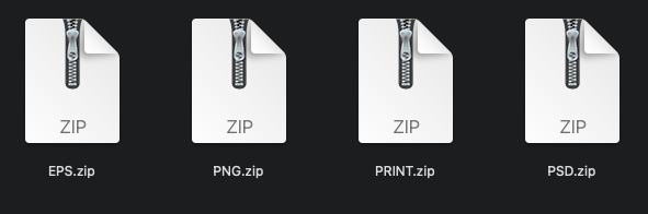
I deliver the original editable Photoshop PSD so you can inspect the channels, understand how the work was built, and make adjustments later if needed. I also deliver a Multichannel EPS for use in a RIP production workflow.
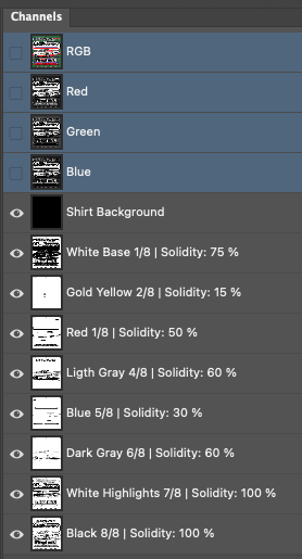
You also receive reference images showing the inks, print order, and Solidity values assigned to the Photoshop Spot Channels. These values document how I simulated the separation in Photoshop; they do not directly represent the physical ink coverage on press.
Files related to the job
I also preserve files related to the project. If you send a low-resolution original and I need to retouch or rebuild part of it, I keep the original alongside the prepared version.
Other important materials used during the process can remain with the project as well. You receive the history of the work, not just an isolated final file.
Halftoned PNG files when needed
If you do not use a RIP, or prefer files with halftones already applied, I can also prepare the channels as high-resolution 600 DPI PNG files.
In that case, tell me the halftone settings you need in advance. You can choose the workflow that best suits your production: editable PSD, Multichannel EPS, or PNG files with halftones already applied.
Your Client Area
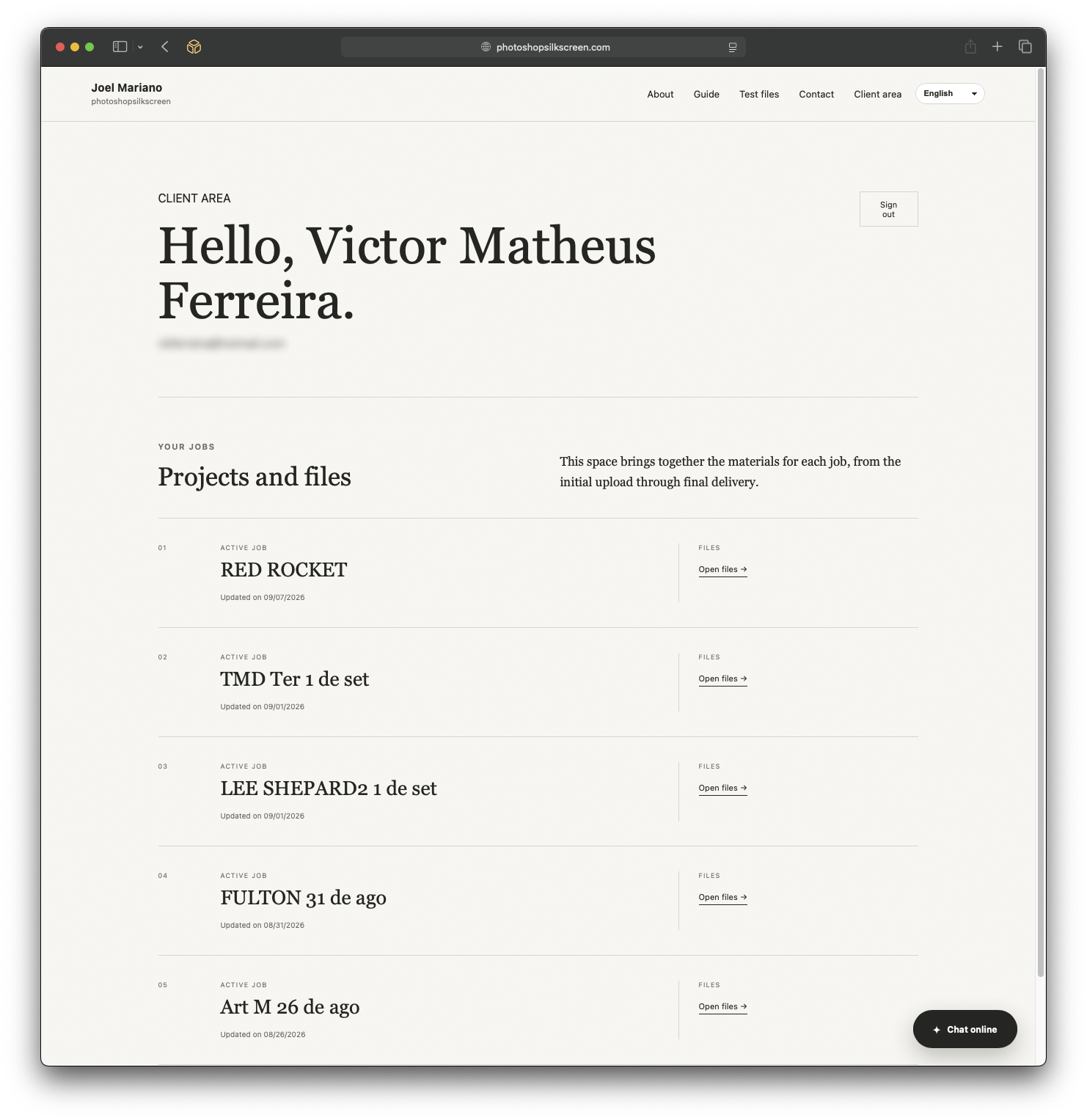
Once the project is created, you receive access to your Client Area. You can download the job files there whenever you need them.
If you request a correction and I update a file, the new version becomes available in the same project folder. That folder remains the reference for the job, so you do not have to search for the latest email attachment or determine which version is correct.
You can talk to me in your own language
In the site chat, you can write normally in your own language. I receive your message translated into Portuguese and reply in Portuguese; you receive my answer translated back into your selected language.
The conversation can continue throughout the job. You can return to the site, reopen the chat, and talk to me about the project, request a change, ask a question, or discuss a new job.
How to send me your artwork
You do not need to follow a complicated system. Send the file in the easiest way for you: directly by email or through a Google Drive, Dropbox, or other service link.
You can also contact me first through the chat or contact form and send the file afterward. When I receive the material, I will evaluate the image, determine what needs to be done, and provide a quote before I begin.