Two ways to build a layered image in screen printing
Starting with light or shadow changes what each ink needs to do. Butterfly and Golden Empress show two ways to plan how an image is built in print.
When we talk about color separation for screen printing, it is very common to think first about how many colors we will use, which inks to choose and how to reproduce the image as faithfully as possible.
But there is a decision I consider just as important: where do we begin building the image?
We can start with the lightest areas and move toward the shadows. Or we can do the opposite, beginning with dark colors and gradually building the brighter areas.
Both approaches work. And, depending on the image, they can produce very interesting results.
What changes is not just the print sequence. The role each ink plays in building the image changes too.
When we start with light colors
One of the best-known ways to work with separations for dark fabrics is to begin with a white underbase.
This first layer creates a light surface onto which the other colors are printed. Depending on the job, the white underbase may provide much of the coverage needed for the colors to show correctly on the fabric.
Imagine an image built with white, pale beige, beige, brown and black.
In this case, we can begin by establishing the light areas and then progressively add the darker colors, building volume, shadows and detail.
One advantage of this approach is that a darker color printed over a light surface does not always need to be highly opaque.
Think of orange printed over a yellow layer. Depending on the inks and the intended result, that orange can work very well without needing an extremely opaque formulation.
This lets us distribute the responsibility for coverage across the layers, rather than expecting every ink to work in the same way.
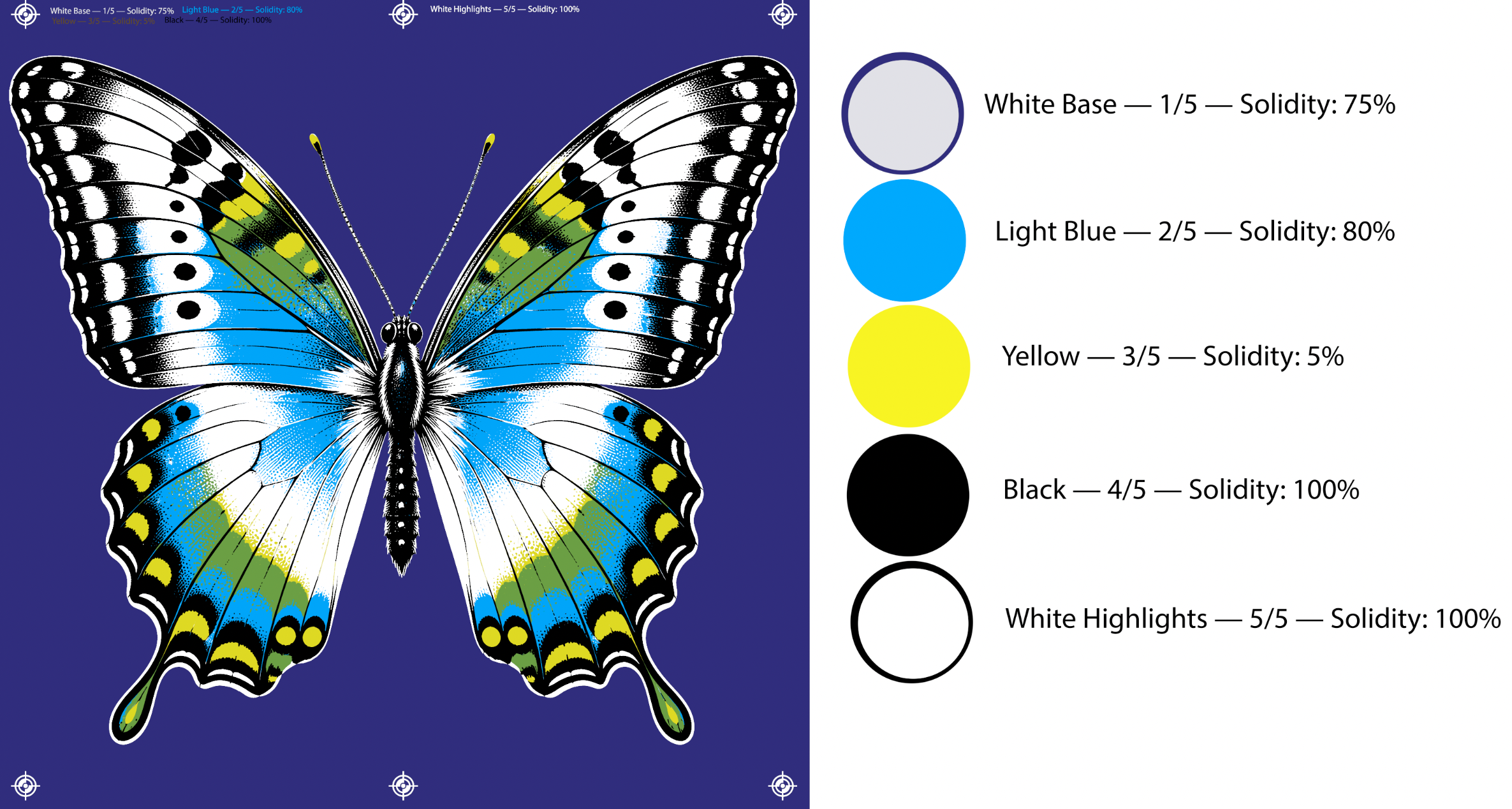
Butterfly: a construction beginning with a white underbase
On my website, I have already made a butterfly color-separation study available, using five screens.
The sequence starts with a white underbase, followed by light blue, yellow, black and white highlights.
This example also shows another interesting characteristic of screen printing: we do not necessarily need a separate ink for every color that appears in the image.
In this job, translucent yellow printed over blue also contributes to forming green.
In other words, we are not simply placing five colors side by side. We are using the interaction between layers to build the image.
What if we start with dark colors?
Now imagine that, instead of beginning by creating a light surface, we decide to build the darkest areas first.
In this type of separation, the first inks establish shadows, depth and volume. We then add intermediate colors and, finally, the lightest tones responsible for the brightest areas.
It is a different way of thinking about the image.
Instead of building shadow over light, we start with shadow and gradually reveal the light.
But there is an important point: ink opacity also needs to follow that decision.
A dark ink printed over a light surface can generally produce a visible result fairly easily. A light ink printed over a dark layer, on the other hand, needs enough coverage to retain its intensity.
That does not mean every dark ink can be transparent.
Imagine, for example, royal blue printed on a black shirt. If the ink is not opaque enough, the blue may become much darker than expected, approaching navy blue or even disappearing visually in certain areas.
So the decision does not depend only on whether an ink is light or dark. It also depends on the surface it will be printed on and the result we want to achieve.
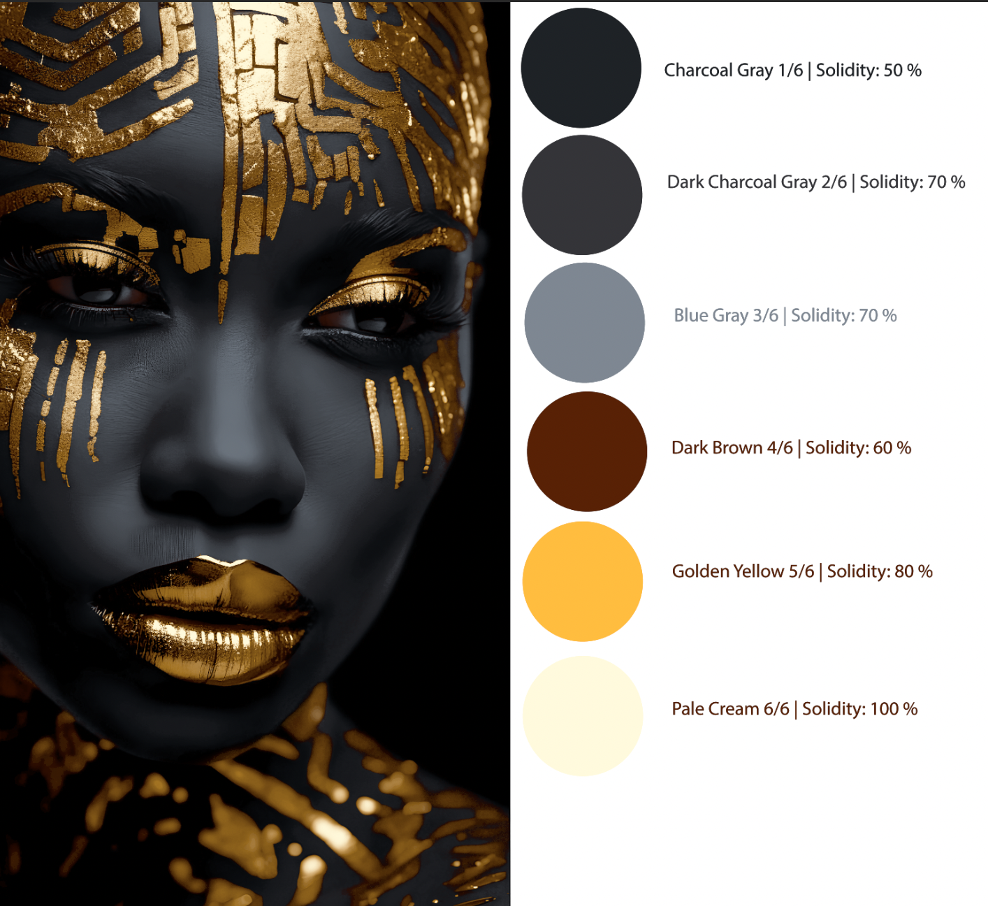
Golden Empress: building the image from black
Golden Empress is an example I prepared specifically for printing on a black shirt.
That detail matters, because the fabric color itself takes part in building the image.
Instead of trying to cover the entire dark area with ink, I use the black of the shirt as part of the deepest shadows. From there, I begin building the facial volumes with different shades of gray.
The image emerges gradually.
First the dark areas appear, then the intermediate tones and, finally, the brightest areas.
For Golden Empress, I used six colors:
| Sequence | Color |
|---|---|
| 1 | Charcoal Gray |
| 2 | Dark Charcoal Gray |
| 3 | Blue Gray |
| 4 | Dark Brown |
| 5 | Golden Yellow |
| 6 | Pale Cream |
The first colors build the facial volumes. Brown and golden yellow then begin developing the metallic details, until we reach pale cream, responsible for the brightest highlights.
One interesting thing about this image is that we are not trying to reproduce gold with a single ink.
The metallic appearance depends precisely on the relationship between very dark areas, intermediate tones and small points of light.
That contrast helps create the impression of shine.
And because the image was designed for an entirely black shirt, I do not need to artificially build every dark area. The fabric itself already does part of that work.
In this case, starting with dark is not just a sequence choice. It is a way of making use of the characteristics of the surface the image will be printed on.
Opacity is also part of the separation
Something I consider important in my work is not treating every ink as though it needed the same characteristics.
In a construction that starts with a white underbase, that first layer can take on much of the responsibility for coverage over a dark fabric.
The following colors, depending on the situation, can work with lower opacity, making use of the surface already prepared.
When we begin with dark colors and move toward light ones, that distribution of responsibilities can change.
The lighter inks need to be able to show over what has already been printed.
But this does not simply mean using as much ink as possible.
An excessive layer can also create printing difficulties and change the visual result.
The aim is to find a balance between coverage, color intensity and the amount of ink deposited.
That is why I consider the choice of inks and their characteristics part of planning the separation itself, rather than a decision made only after the channels are ready.
So which of the two approaches is better?
I do not consider one approach superior to the other.
Some images work very well when we begin with a light base. Others offer interesting possibilities when we build the dark areas first.
And not every separation needs to follow a perfectly ordered progression from white to black or black to white.
Depending on the design, we can combine different relationships between colors, use the fabric itself as part of the image and choose a sequence that makes more sense for that job.
What matters is understanding what each layer needs to do.
Sometimes an ink needs to provide coverage. At other times it only needs to add a hue, reinforce a shadow or build a point of light.
When we understand these differences, separation stops being merely a division of the image into channels and becomes a way of planning how it will actually be printed.
That is exactly what the two studies presented here aim to demonstrate.
Butterfly uses a construction beginning with a white underbase, including the interaction between blue and yellow to form another color.
Golden Empress, meanwhile, was developed exclusively for a black shirt, using the fabric itself as part of the shadows and gradually building the brighter areas.
They are different images, with different needs and different solutions.
In the end, it is not about choosing whether to start with light or dark. It is about understanding the image and deciding which path allows us to build it better in print.